Table of Contents
- A Worktop Is Never Seen on Its Own
- Visual Planning Helps Compare Materials Before Installation
- Colour and Veining Have to Suit the Room
- Islands and Breakfast Bars Deserve Extra Thought
- Open-Plan Kitchens Are Easier to Judge in Three Dimensions
- Bathroom and Utility Surfaces Need the Same Care
- The Practical Details That Change the Final Look
- Don't Decide From Samples Alone
- A Checklist Before You Approve a Worktop
You've held the sample under the showroom lights and you're sold. That particular quartz, the soft grey with the faint movement through it — it's the one. Then it arrives, gets installed, and somehow it reads colder than you remember, the veining fights with your splashback, and the whole thing sits oddly against the oak flooring you chose months ago. Nothing went wrong, exactly. The sample was honest. It just couldn't tell you how the stone would behave once it was surrounded by your actual cabinets, your actual light, your actual room. And that gap — between a beautiful offcut on a showroom counter and a fitted worktop in a finished kitchen — is where a lot of expensive regret lives. Picturing the whole room before you commit is how you avoid it.
A Worktop Is Never Seen on Its Own
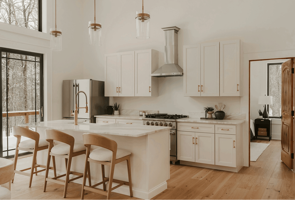
A worktop sample sits in isolation. A fitted worktop never does. It's framed by cabinet doors, grounded by the flooring, met by the splashback, interrupted by the sink and the hob, and lit by whatever combination of window and downlight your kitchen happens to have.
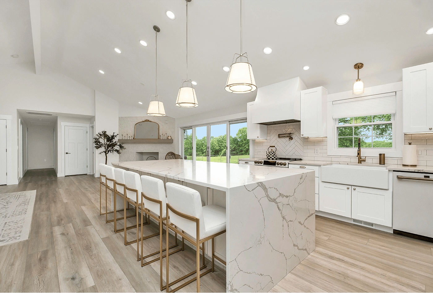
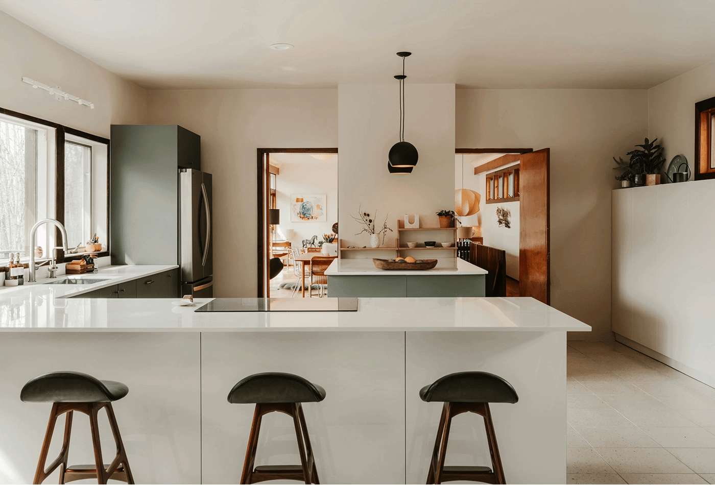
Every one of those things changes how the stone reads. A warm-toned timber cabinet pulls different notes out of a grey worktop than a crisp white slab cabinet does. A busy patterned floor competes with a strongly veined surface in a way a plain floor never would. The brushed brass tap that looks gorgeous in the brochure might clash with the cool undertone of the stone you've chosen. None of this is visible when you're staring at a 100mm sample and all of it determines whether the finished kitchen feels considered or slightly off in a way you can't quite name.
Visual Planning Helps Compare Materials Before Installation
This is where seeing the materials together, rather than one at a time, earns its keep, particularly when you're torn between options that look similar in sample form but behave very differently across a full run.
Quartz and granite read differently at scale. Marble and quartzite can look almost identical in a small piece and feel worlds apart once they're a worktop. Porcelain and Dekton, polished against matte, a subtle background veining against a dramatic statement slab, these distinctions barely register at sample size and dominate once they're installed. When comparing worktop colours, cabinet finishes and splashback materials, visual planning can make the decision clearer. Resources such as https://archicgi.com/interior-
Colour and Veining Have to Suit the Room
The mistake people make most often with stone is treating colour and veining as standalone choices rather than as decisions about balance.
A boldly veined marble can be magnificent in a generous kitchen and overwhelming in a small galley, where it leaves the eye nowhere to rest. The reverse holds too — a plain, quiet worktop can be exactly what a kitchen with busy patterned cabinets or a striking floor needs to calm things down. Cool grey stone that looked smart under the showroom's bright white lighting can turn flat and a little dreary under the warm bulbs most of us actually have at home. White can read fresh and crisp or cold and clinical, depending entirely on what surrounds it. And dark worktops, which photograph beautifully, demand good lighting to avoid making a room feel closed in.
The point isn't that any of these are wrong. It's that the right answer depends on the rest of the room, which is exactly why judging the stone alone leads people astray.
Islands and Breakfast Bars Deserve Extra Thought
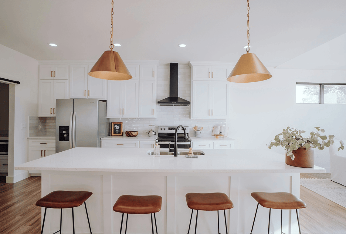
If you're putting in an island, you're choosing the most looked-at surface in the kitchen — visible from every angle, often the first thing you see walking in, and the natural gathering point. It rewards more planning than a run against the wall.
Scale comes first: an island worktop has to suit the size of the room around it, with enough circulation that people aren't squeezing past. Then the details that only matter on islands – the overhang for breakfast-bar seating, whether you want a waterfall edge carrying the stone down the sides, how the veining runs across the surface and whether it'll be bookmatched, where any seams fall, how a hob or sink cut-out sits within the slab. On a heavily veined stone, the direction of the movement and the placement of a joint can be the difference between something that looks designed and something that looks assembled.
Open-Plan Kitchens Are Easier to Judge in Three Dimensions
If your worktop lives in an open-plan space, a single photo or sample tells you even less, because the surface now has to work as part of a larger room seen from multiple positions. How does the island read from the sofa? Does the worktop colour sit well against the dining furniture across the room? What do you see of the kitchen from the front door, and does it hold together from that distance? These are spatial questions that a flat image struggles with. For larger renovation projects, a static image may not be enough to understand how the kitchen, dining area, island, and storage zones connect. Resources such as 3D Virtual Tours show how a virtual tour can let viewers move through a planned interior and understand the space more clearly – checking that the worktop works from every angle it'll actually be seen from, not just the one the sample photo was taken at.
Bathroom and Utility Surfaces Need the Same Care
The same logic carries straight into the bathroom and utility room, where stone surfaces are just as visible and just as permanent. A vanity top has to sit right with the basin, the tiles, the wall colour, and the often less-than-ideal lighting of a bathroom. Shower walls, upstands, recessed niches, utility counters — each one is a material decision that benefits from being seen in context rather than chosen blind. There's a practical layer here too: moisture resistance and ease of cleaning matter more in these rooms, and a stone that's perfect in a kitchen might not be the sensible pick around constant splashing. Planning these surfaces with the same care as the kitchen keeps a home feeling coherent rather than like a series of separate decisions.
The Practical Details That Change the Final Look
Beyond colour and material, a set of fabrication choices quietly shapes the finished result, and they're easy to underthink until they're permanent. Edge profile sets the character — a sharp square edge reads modern, a softer bullnose more traditional. Thickness changes the whole feel of a worktop, slim and contemporary or chunky and substantial. Then there are the cut-outs for sink, hob, and taps; the upstands and splashbacks; where the seams fall and how visible they'll be; whether veined slabs are bookmatched. These get resolved during templating and fabrication, which is precisely why it's worth picturing the whole thing beforehand — so you're approving choices you've actually visualised rather than discovering them at installation.
Don't Decide From Samples Alone
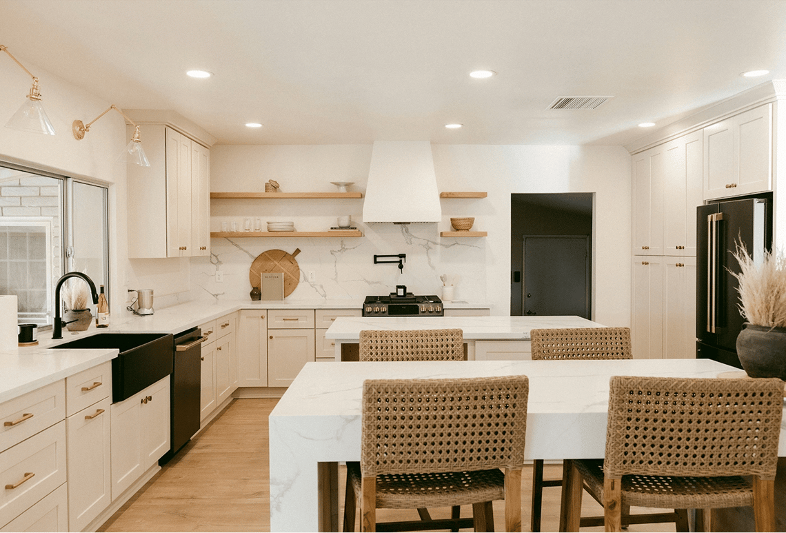
Samples are a starting point, not the whole picture, and natural stone makes this especially true because a single slab can vary considerably across its surface. Ask to see full slab photographs, not just the offcut. Look at installed examples of the same stone in real kitchens. View your shortlist in daylight and again under evening light, since they'll look like two different materials. Bring your cabinet door sample, a piece of your flooring, your paint colour, and the finish of your sink and tap into the comparison, because the worktop's job is to work with all of them. The more of the real room you can assemble before you commit, the fewer surprises will be waiting at installation.
A Checklist Before You Approve a Worktop
Worth running through before you sign anything off: Have you seen the stone next to your actual cabinet colour and flooring? Have you checked how it looks in both daylight and evening light? Is the veining direction planned, and the seams agreed? Are the sink, tap, and hob cut-outs confirmed? Have you chosen your edge profile and thickness? Does an island have enough room to move around it? Is the splashback or upstand coordinated with the worktop? And are any bathroom or utility surfaces planned to sit consistently with the rest of the home?
A worktop is a working surface and, increasingly, the centrepiece of the room — which means the best choice isn't simply the most beautiful slab in the showroom. It's the one that holds together with everything around it. Spend the time picturing the whole kitchen before fabrication starts, and you trade a stressful gamble for a confident decision, and the expensive surprises tend to stay where they belong: out of your finished kitchen.